The Landing Page Builder lets you design professional, conversion-ready pages for your community. You can promote courses, events, memberships, workshops, and digital products - all within GroupApp.
Each page can include pricing plans, checkout flows, event listings, and interactive widgets, giving you full control to sell, upsell, or collect leads without relying on external tools.
Landing Pages bring marketing and delivery together in one system.
Enables you to communicate the value of your offer, be it courses, events, or membership programs.
They keep design consistent with your brand and make checkout frictionless, and give visitors a clear path from interest to purchase.
You can promote multiple products, test offers quickly, and manage all sales pages from one dashboard.
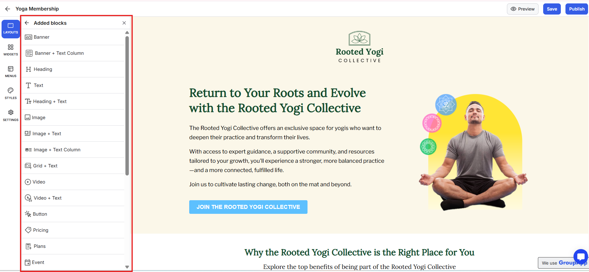
What it is: The main canvas where you structure your landing page and arrange, and design all page blocks.
What it’s useful for: Controls the order and flow of your content, from introduction to features, to call-to-action. A strong layout helps visitors move naturally through your story, reduces confusion, keeps focus where you want it, and improves conversion.
Examples:
Start with a hero section that captures attention.
Follow with course or plan blocks to show value.
End with a payment or lead form to drive action.
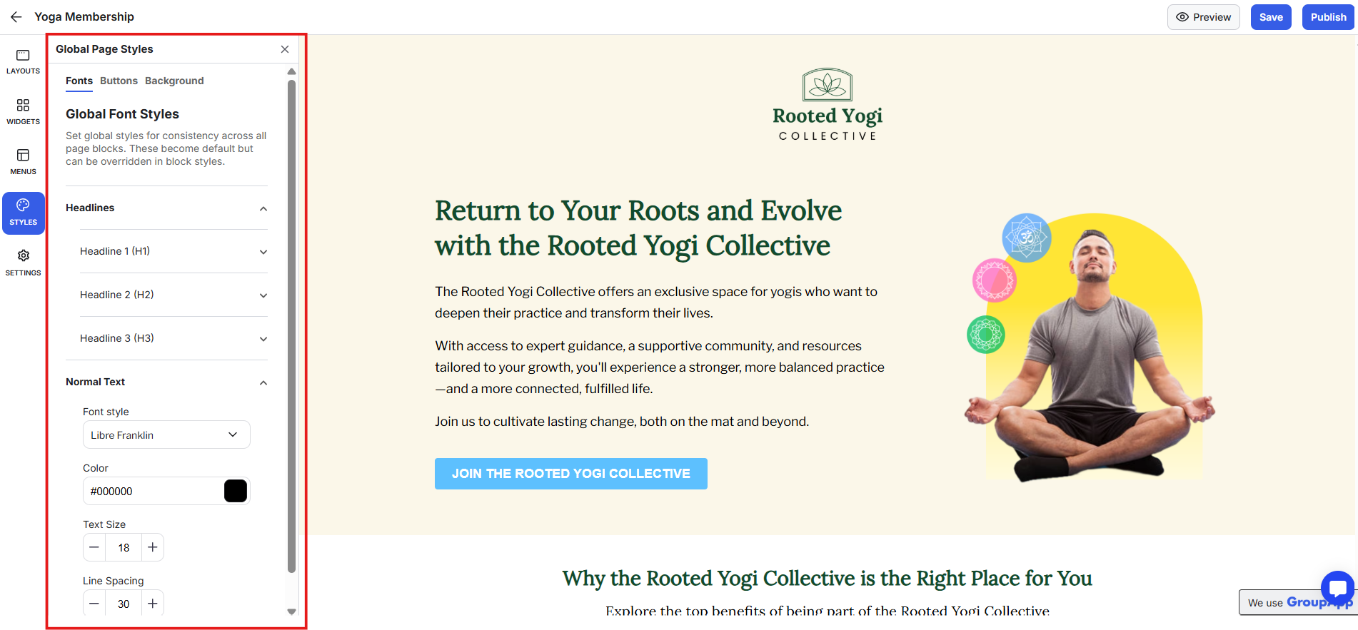
What it is: The global design control for your entire page. It manages fonts, button styles, and background colours.
What it’s useful for: Creates consistent branding without needing to style each element separately. You can apply your brand fonts to headings and text, use matching button designs across all CTAs, and choose a background image or colour that reinforces your visual identity.
Examples:
Apply brand colors and fonts to headings and text.
Adjust button styles once and update every CTA.
Use a background that aligns with your community theme.
Global styles save time, keep your look cohesive, and ensure every landing page element/block feels like part of the same brand.
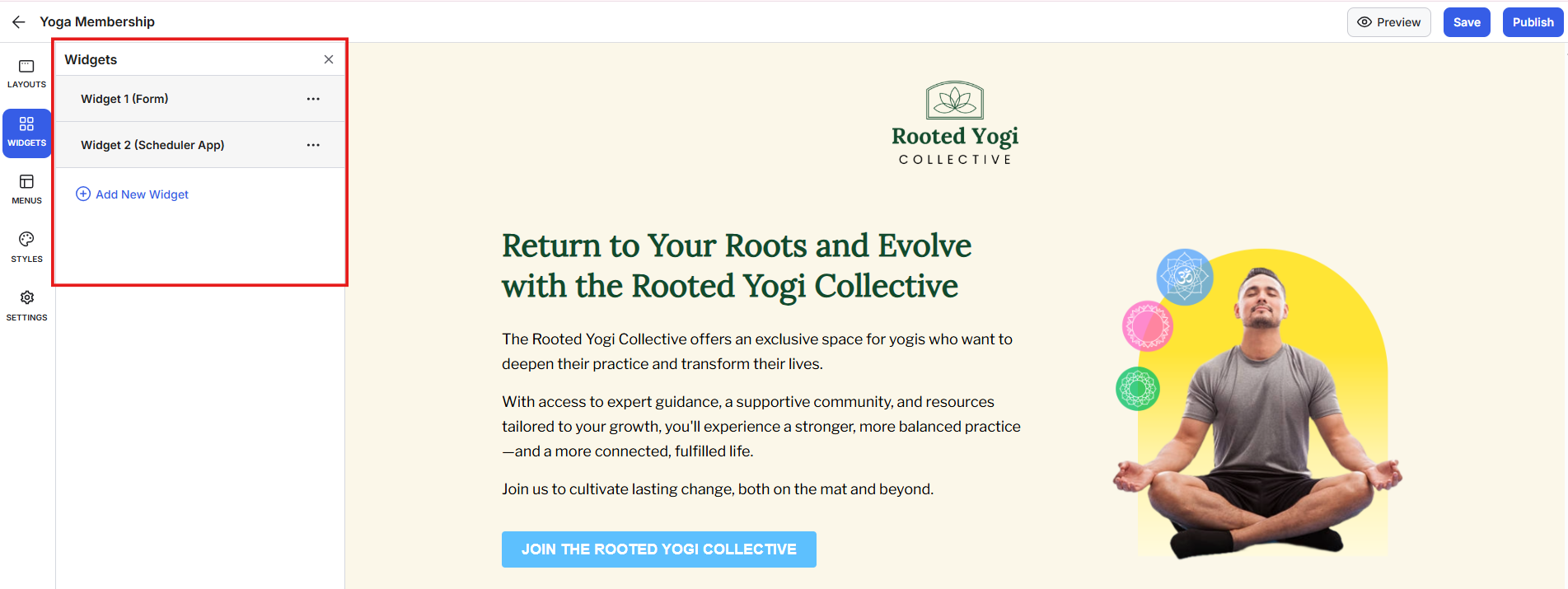
What it is: Interactive tools such as lead capture forms, scheduling links, and custom embeds.
What it’s useful for: Turns your static page into an interactive experience that collects information or bookings directly from visitors.
Widgets can include lead-capture forms, Calendly scheduling links, or custom HTML embeds such as Typeform or Google Forms. They appear as pop-ups triggered by buttons, letting visitors sign up or interact without leaving your page.
Examples:
Use a lead capture form to grow your list.
Add a Calendly widget for easy 1:1 bookings.
Embed a Typeform survey to collect feedback.
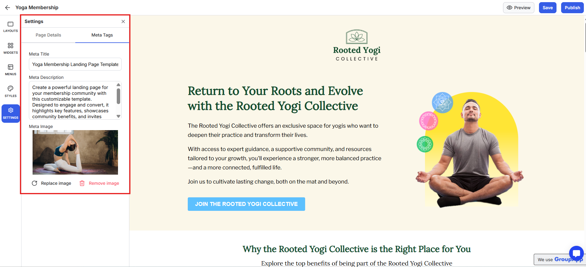
What it is: The place where you manage your page title, meta description, meta image, URL, and SEO details to improve visibility when your page is shared or indexed.
What it’s useful for: Keeps your pages discoverable, well-labelled, and optimised for search.
Examples:
Customise your URL for each offer or product.
Add a meta description to enhance search clicks.
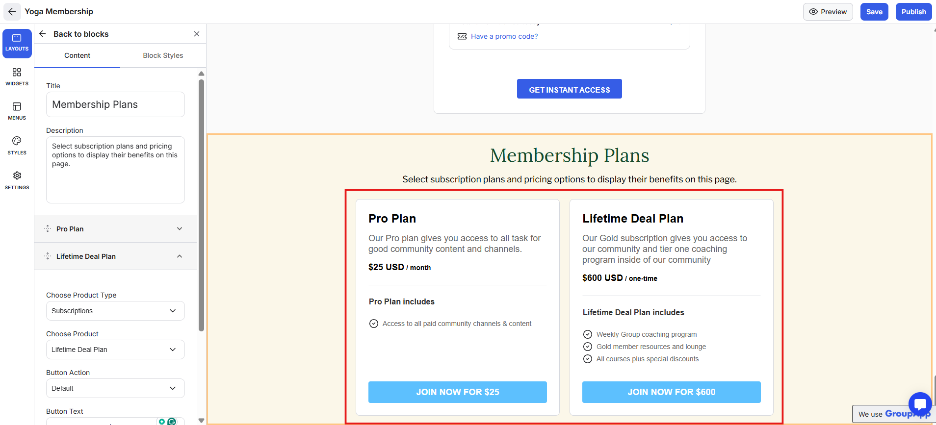
What it is: A visual block that displays your pricing tiers or membership options.
What it’s useful for: Helps visitors compare options quickly and choose the one that fits them best.
Examples:
Show side-by-side plans for memberships or courses.
Highlight your best-value plan with a featured tag.
Add benefit lines for each tier to clarify what’s included.
Transparent pricing builds trust and makes it easy for visitors to commit.
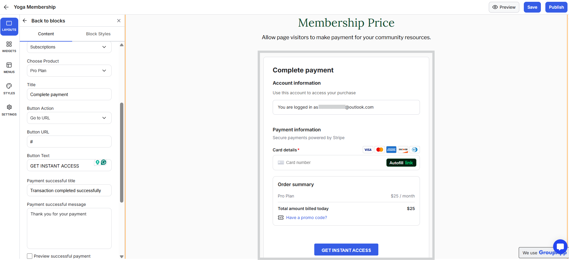
What it is: A checkout section that handles direct sales or post-purchase upsells.
What it’s useful for: Turns your landing page into a complete, self-contained checkout flow. You can also create an upsell payment block that appears after a purchase, for example, offering a premium course or an annual plan upgrade.
Examples:
Sell event tickets directly from the page.
Offer an upsell after checkout for a higher-tier plan.
Add a follow-up product after a course purchase.
Keeping checkout and upsells in a single flow increases order value without adding friction.
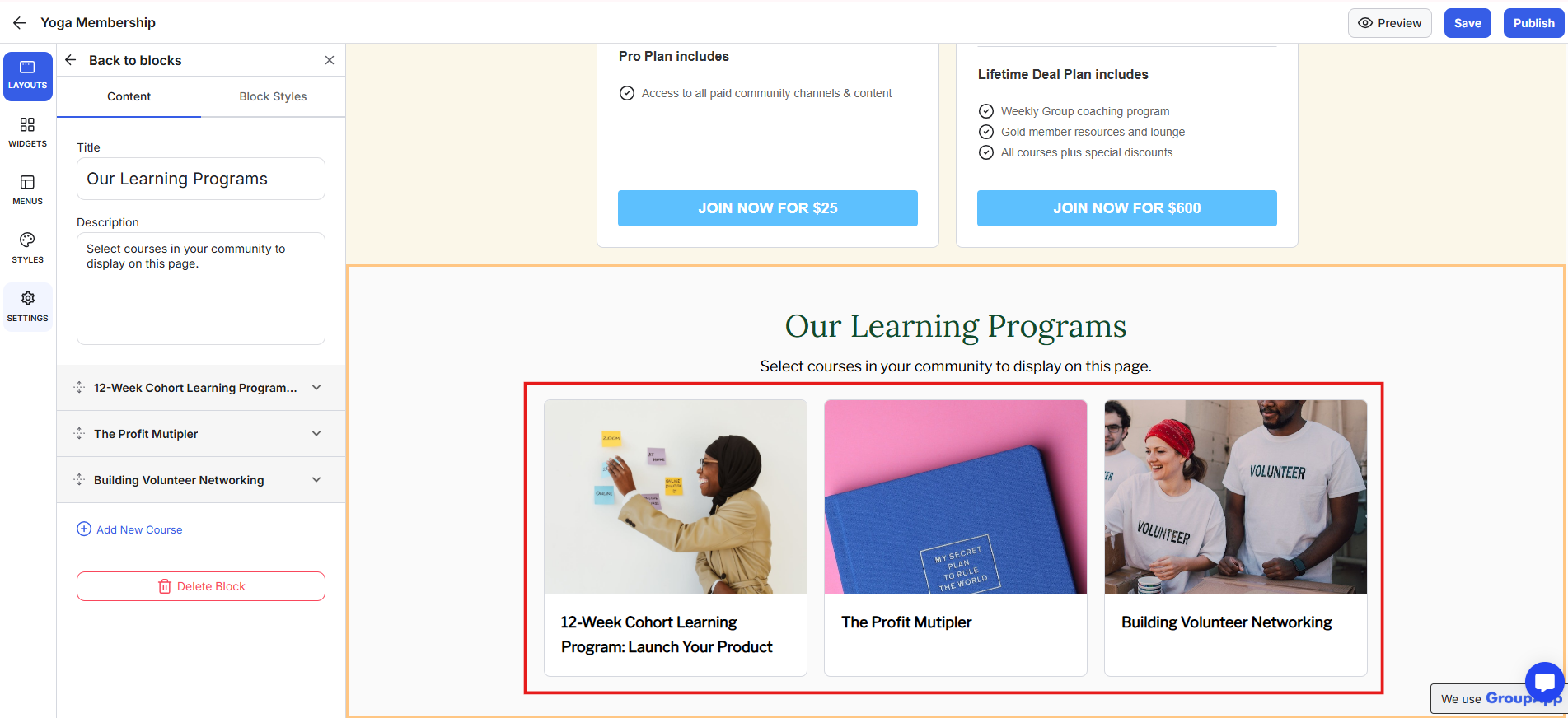
What it is: A showcase block that displays your public courses.
What it’s useful for: Gives visitors an overview of what they can learn and lets them enrol instantly.
The Courses Block lists multiple published, publicly visible courses. It’s a simple way to display your full course catalogue while keeping attention on learning outcomes.
Examples:
Highlight your latest or most popular programs.
Show current enrolments and upcoming start dates.
Feature training programs to attract new learners.
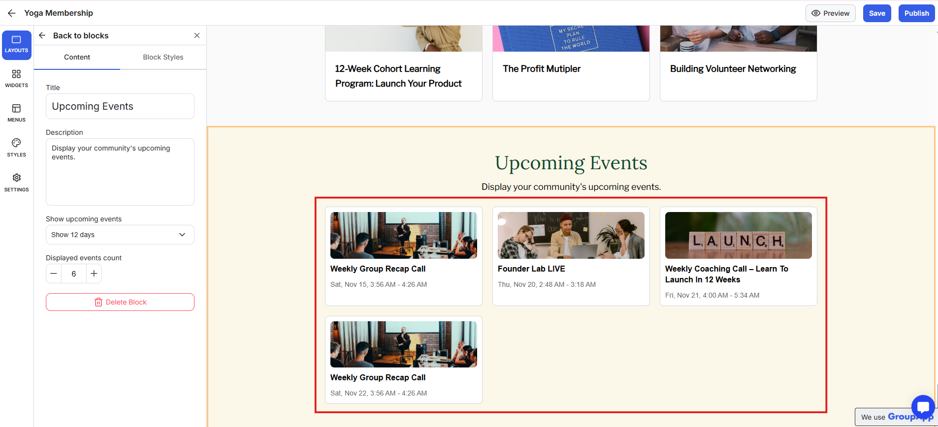
What it is: A block that lists your community’s future events within a selected date range.
What it’s useful for: Keeps your calendar of live sessions and workshops visible to both members and visitors. It automatically displays published, public events scheduled for future dates.
Examples:
Promote live training sessions or challenges.
List upcoming Q&A sessions or community calls.
Highlight free events for wider reach.
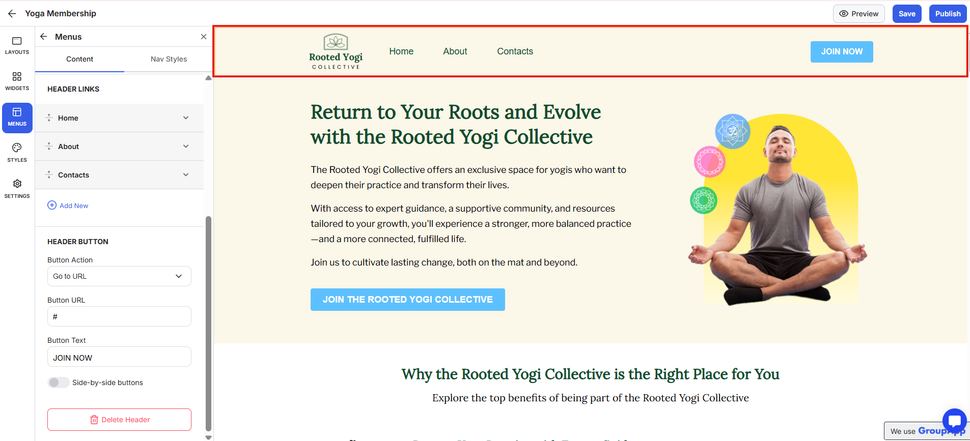
What it is: Customisable header and footer sections that can be added to any landing page.
What it’s useful for: Creates a professional, membership website structure and consistent navigation.
Examples:
Header with your logo, main links, and a “Join Now” button.
Footer with copyright, terms, and social media icons.
Mobile app download buttons for visitors on phones.
Start by defining the purpose of your landing page: what one action you want visitors to take.
Build the layout around that action, and include only the sections that support it. Keep the message short and direct.
Use your brand colours, consistent fonts, and a single call-to-action that repeats throughout the page.
Program or course sales: Design a full sales page for your course, include pricing and testimonials, and add a payment block so visitors can purchase instantly.
Event promotion: List upcoming events with the Events Block and add an RSVP or checkout link. This keeps your workshops visible and easy to join.
Membership offers: Display multiple pricing tiers with the Plans Block so visitors can compare benefits and sign up for the right level.
Upsell flows: Redirect buyers to a page with an upsell Payment Block for a higher-tier offer or a complementary product.
Lead capture or scheduling: Embed a lead form or Calendly widget to collect prospects or book consultations directly from the page.
Membership website: Combine headers, footers, and consistent styling to create a membership website.
Keep each page focused on one goal: sales, purchase, registration, or signup. Use one clear message and repeat your main CTA.
Write short, benefit-driven copy, support it with visuals, and apply your global styles for a cohesive look.
Always preview the page before publishing, and reuse headers and footers to keep your branding consistent.
Can I reuse the same header and footer across pages?
Yes. You can save and apply your header and footer menus to any landing page.
Can I embed external forms or tools?
Yes. Use the Widgets tab to add HTML for Typeform, Google Forms, or other apps.
Can I sell directly from a landing page?
Yes. Add a Payment Block to let visitors complete purchases or view upsell offers directly on the page.
Do I need coding experience?
No. All sections are drag-and-drop and managed visually inside the builder.
Next:
Create Plans Block On Landing Pages
Learn how to add a plans block on landing pages in your community
Related:
Upsell & Payment Block On Landing Pages
Learn how to create upsells and regular payment on landing pages in your community
Also see:
How to Create Courses Block On Landing Pages
Learn how to add a courses block on landing pages in your community