The Community Home Page is a welcome map for members joining your community. You can also set it as a landing page for members when they log back in.
The home page displays critical information and elements relevant to the specific member. This includes suggested courses, upcoming events, and channels they have joined. You can also display the new members tab.
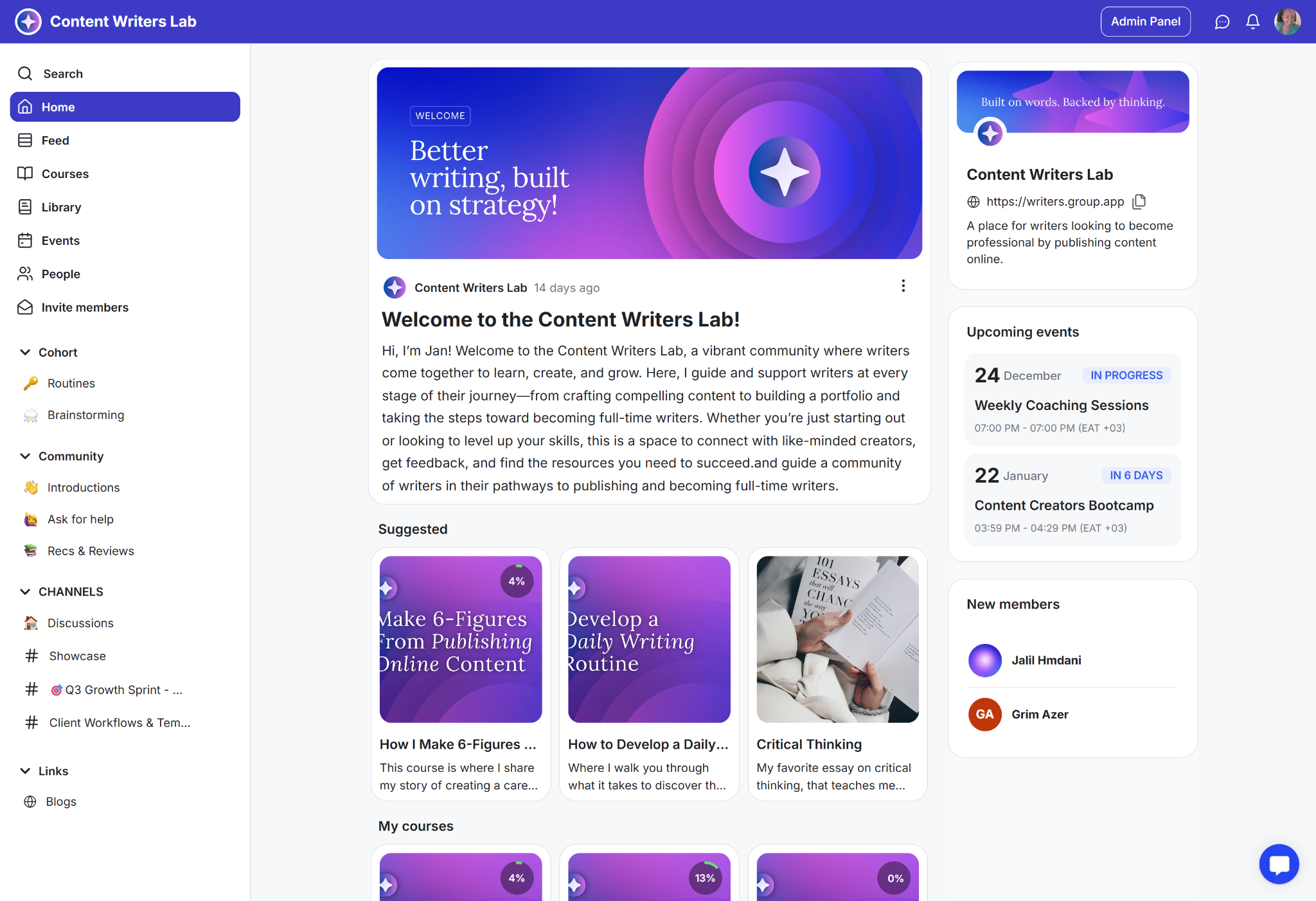
Lets you display welcome notes and important announcements.
Makes updates, offers, and events easy to find and act on
Improves first impressions for new and returning members
A customizable section at the top of the Home Page for displaying welcome messages or critical community updates.
You can use the built-in editor to format text and add media, including images, video, audio, files, or embedded content. Include links to important resources like community guidelines, app downloads, or onboarding steps to direct members.
For example:
Weekly What’s New post with one highlighted action
Launch a spotlight with a link to the offer or info page
Orientation note for new members with a Start Here link
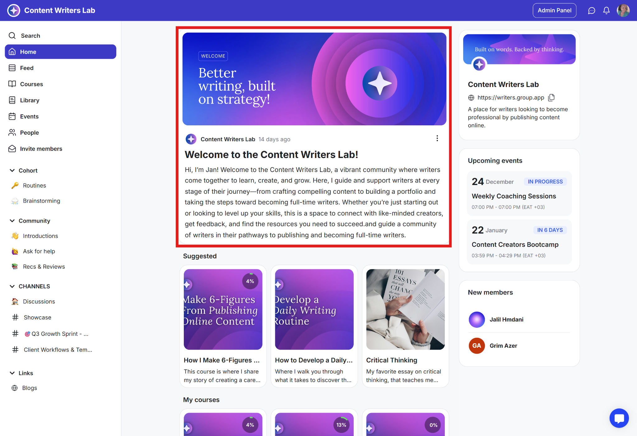
A preview card that automatically displays your community's key details: your community's name, cover image, link, and description.
The card is generated automatically and is not directly edited. If you change your community's name, picture, or details in your profile settings, the card updates automatically.
This feature is designed to provide a consistent, recognizable identity for quick sharing and promotion. It ensures members, visitors, and anyone with the link can instantly identify and access your community.
For example:
Members can copy the community link from the card to invite friends or peers.
Brand details like logo, cover, and description remain consistent across all pages and visits.
New members quickly confirm that they are in the right community, reducing confusion and improving onboarding.
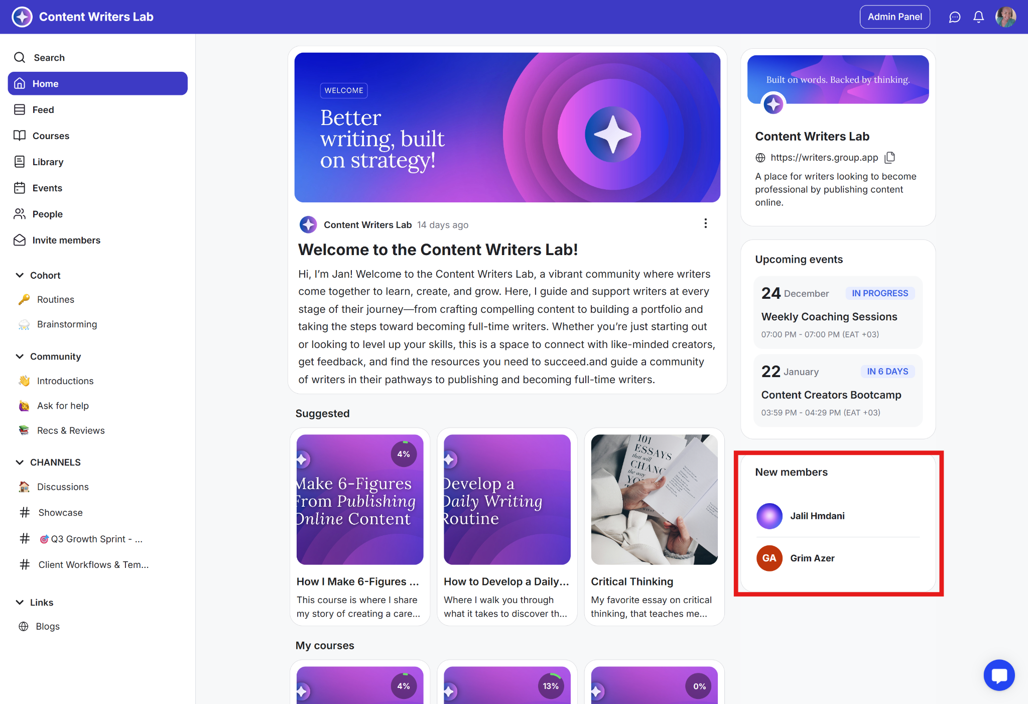
This is a section that highlights recent joiners for a selected time window, such as 7, 14, or 28 days. It directs attention to new members, making community growth visible and normalizing participation.
For example:
Weekly, welcome our new members post to spark replies
Community managers greet newcomers directly
Social proof that encourages first posts
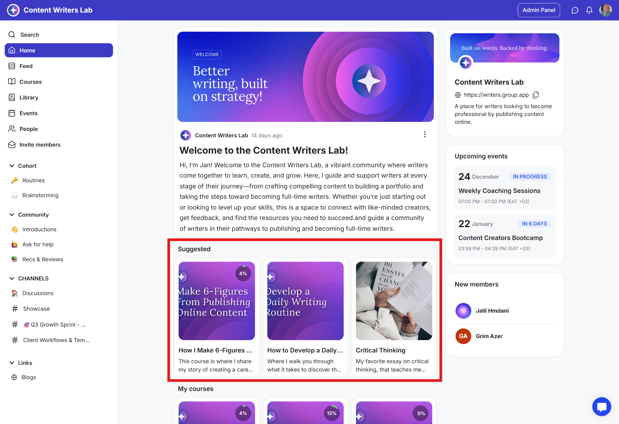
This is a section where you feature courses, guides, and library resources in the order you choose. It directs members’ attention to the most important materials without extra reminders.
For example:
Resurface an overlooked but important guide
Place a premium course after free lessons for a natural upgrade
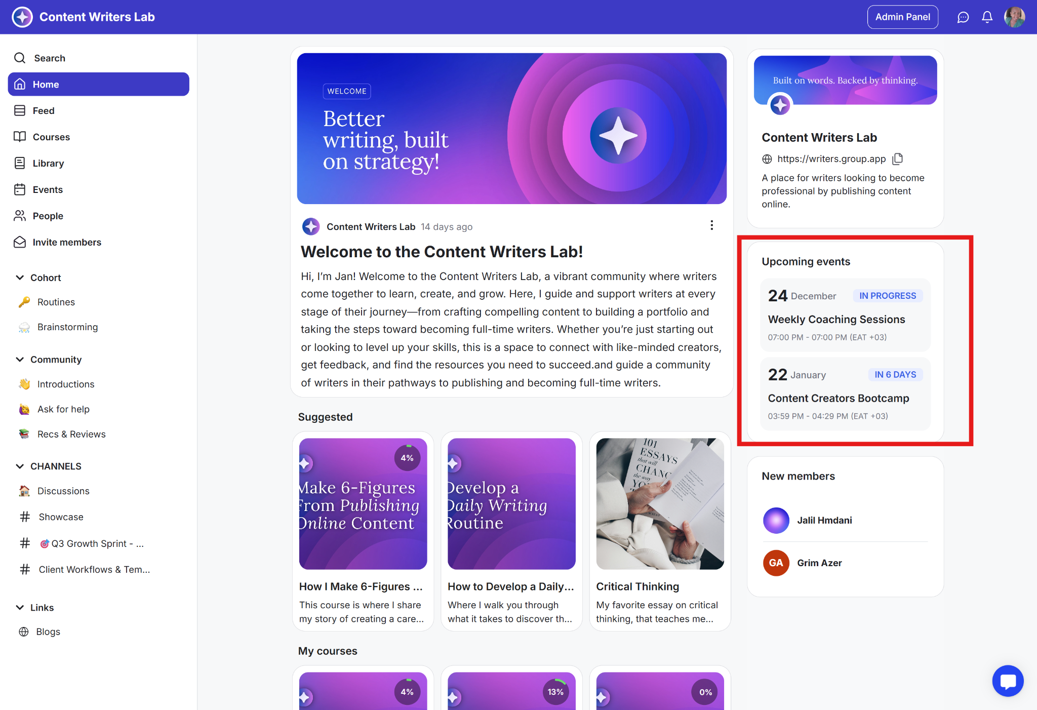
This is a section that lists your next sessions for the coming 7, 14, or 28 days and updates automatically. It directs members’ attention to upcoming activities, helping keep dates visible and boosting attendance.
For example:
Weekly office hours are always in view
Cohort schedule visible at a glance
Workshop registrations stay steady
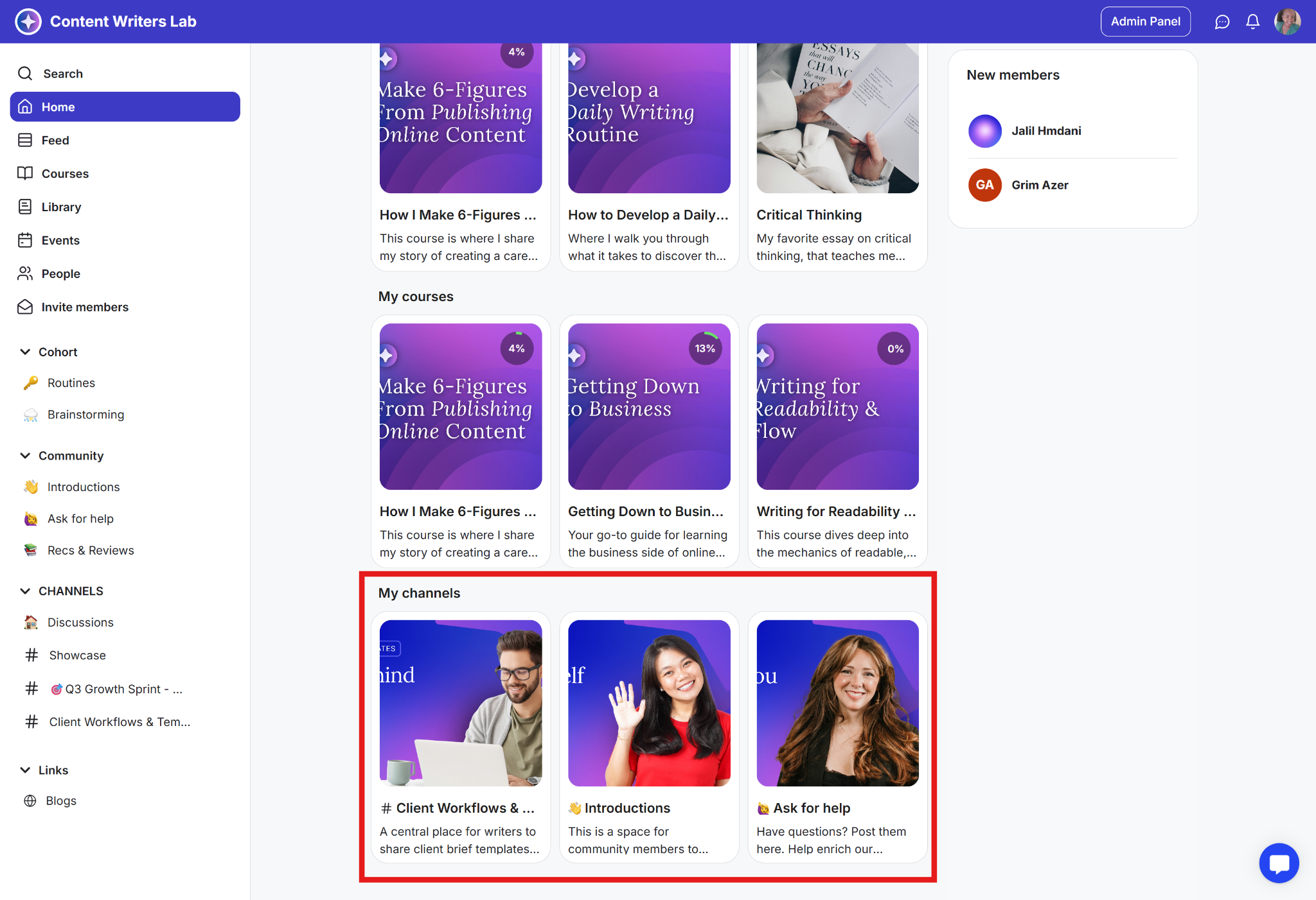
This is a section that shows the channels you have already joined as quick-access cards on the Home Page. It directs members to their active spaces, making it easy to re-enter important areas quickly.
For example:
Quiet members return to a channel in one click
Program channels stay visible during a cohort
Teams see their working spaces without hunting
Decide on the single outcome you want from the Home Page this week. If it’s onboarding, point to Start Here.
If it’s a launch, feature the offer and its event. Keep the page focused, and every element should drive the next step.
Welcome and orientation: New members see a short welcome, a Start Here link, and any other onboarding information.
Weekly focus: Post a Monday “What’s new” on the announcement card, feature one resource in Suggested Content, and keep the next live session visible.
Program flow: Suggested content shows new courses, while Upcoming Events lists the cohort calls. Members always know what’s next.
Momentum and connection: Turn on New Members and prompt a weekly welcome thread. Participation rises when growth is visible.
Keep the Home Page lean; remove anything that doesn’t drive action
Update the announcement card weekly so the page feels alive
Order Suggested Content to create a simple path, not a catalog
Match the events window to your cadence (7 days for weekly calls; 14–28 for cohorts)
Pair the Home Page with Workflows to message new members after their first visit
Use Suggested Content to segment focus: free path first, advanced offer last
Rotate a “Member win” on the announcement card to reinforce outcomes and trust
Treat New Members as a soft community KPI and build a weekly welcome habit
It isn’t set as the default landing page. Update your onboarding default pages.
Keep only what supports your community goals. Hide elements that don’t drive that action.
Seven days for weekly cadence and fourteen or twenty-eight for cohorts and workshops.
Next:
How to Activate and Configure the Community Home Page
This article is about activating and setting up the community home page.
Related:
Setting Up Default Pages for Your Community
Learn how to set where members and visitors land in your community.
Also See:
Community branding and theme
Learn how to set up your community cover image, logo,and brand theme