Your community's branding helps create a consistent experience for your members and reinforces your brand across the platform. From the Branding settings, you can upload your community's visual assets and customize the look and feel of your community using preset or custom themes.
1) Go to the Admin Panel.
2) Click Appearance.
3) Select Branding to open the Branding settings.
4) This opens the Branding settings.
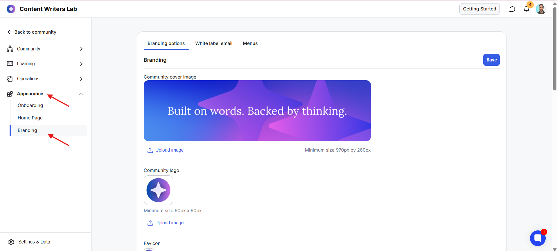
From this page, you can:
Upload your community's brand assets.
Choose a preset community theme.
Set a custom brand color.
Select how your theme is applied throughout your community.
The first section on the page is Community Uploads. This is where you upload the images that represent your community across GroupApp.
Tip: The sizes below are the minimum recommended dimensions. You can upload higher-resolution images using the same aspect ratio for better image quality.
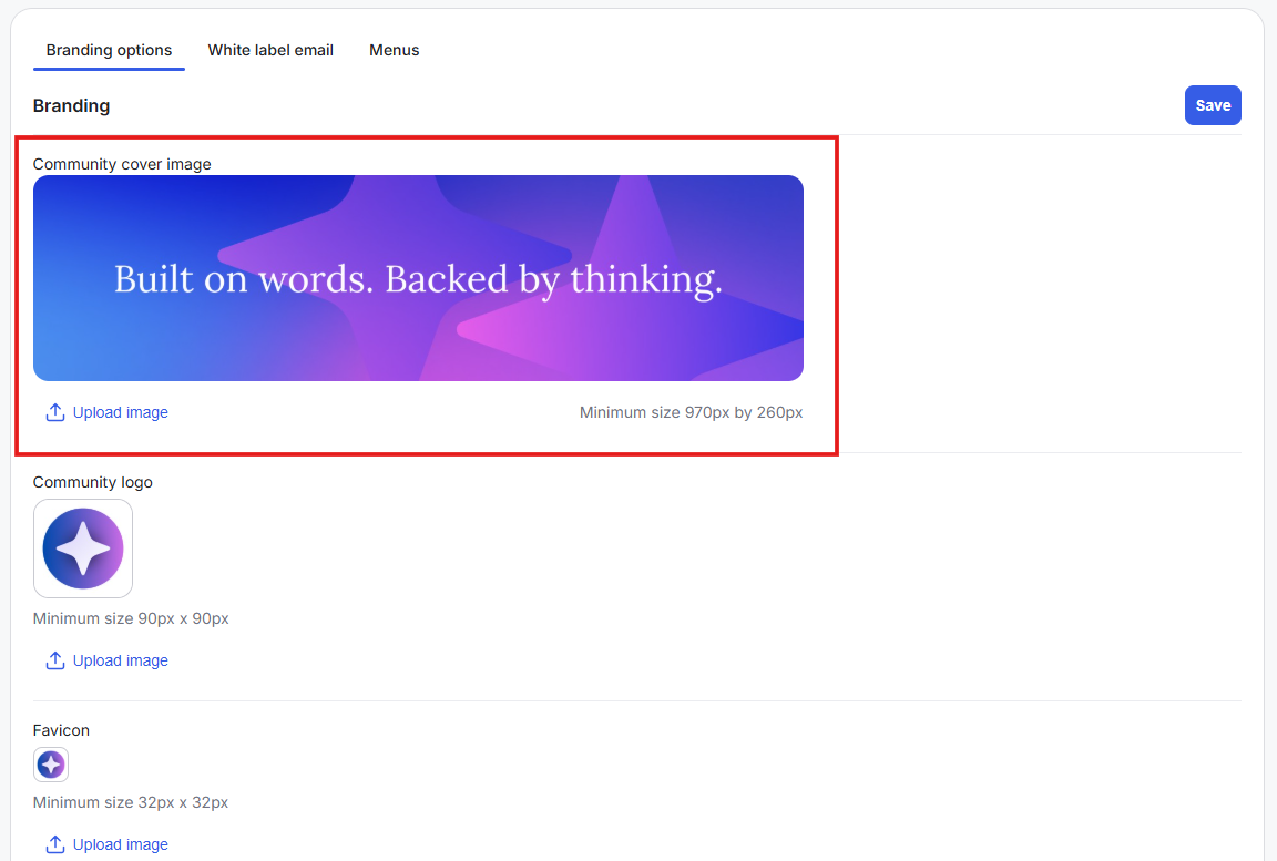
Minimum size: 970 × 260 px
The community cover image appears on the right-hand side of your community home page. It is also used as the preview image when your community link is shared on social media, messaging apps, and other websites.
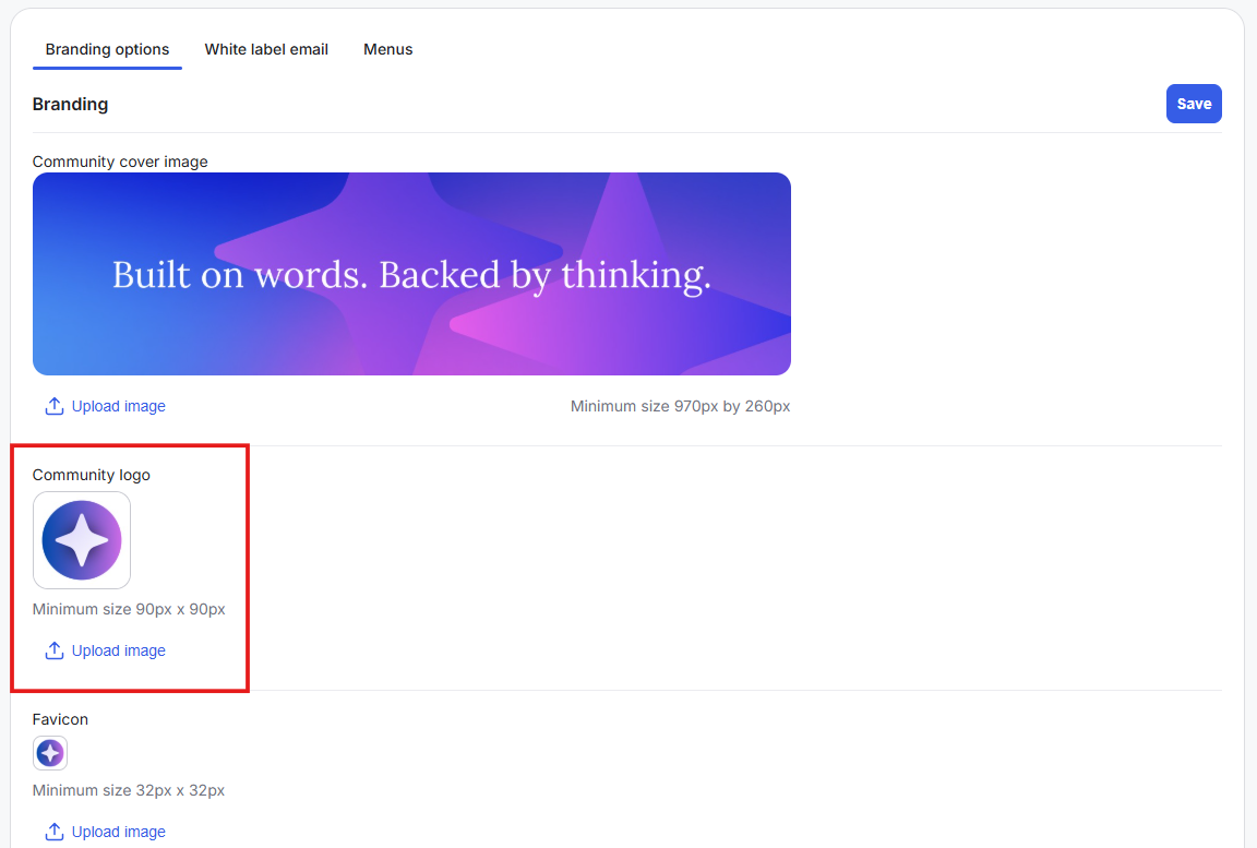
Minimum size: 90 × 90 px
Your community logo appears throughout your community on the top-left corner and helps members quickly recognize your brand.
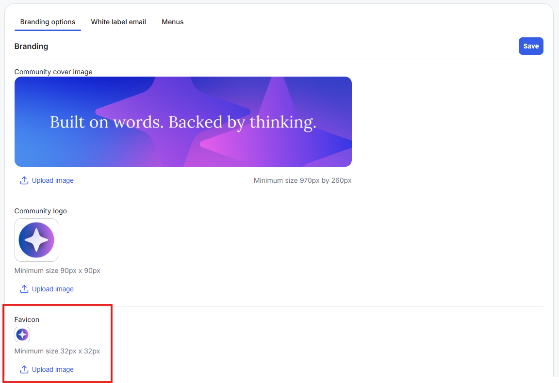
Minimum size: 32 × 32 px
The favicon appears in your browser tab next to your community name, making it easier for members to identify your community when multiple tabs are open.
Once you've uploaded your brand assets, the next section lets you customize your community's colors and overall appearance.
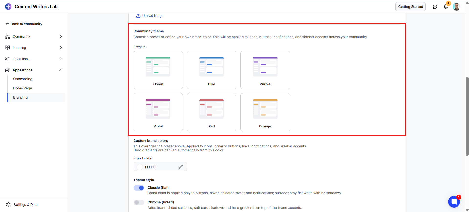
Start by choosing one of the available preset themes. These provide ready-made color combinations that you can apply with a single click.
If you'd like your community to match your own brand, you can override a preset by choosing a custom brand color.
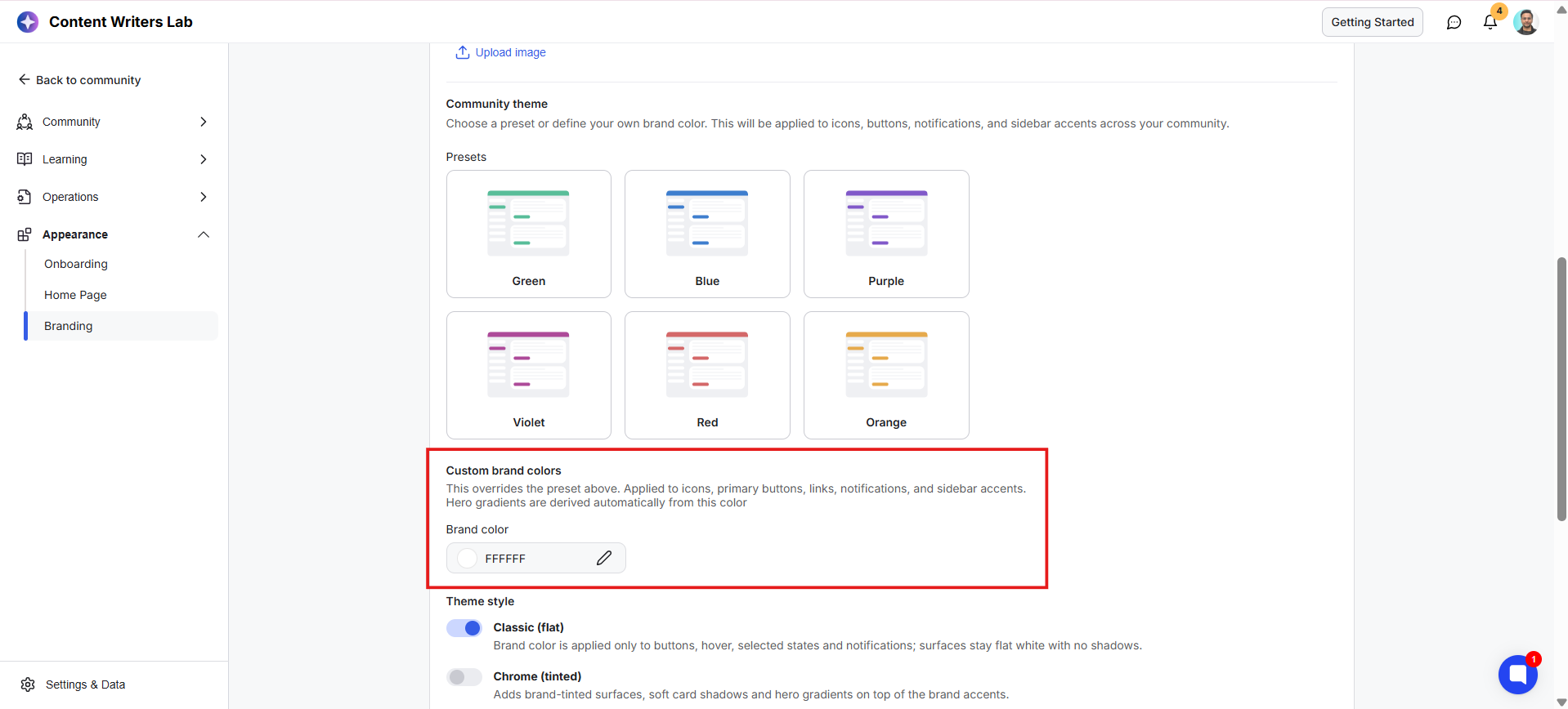
Your selected brand color is applied to:
Icons
Primary buttons
Links
Notifications
Sidebar accents
It is also used to automatically create hero gradients. Hero gradients are the larger colored background areas used in parts of your community. GroupApp generates these automatically from your selected brand color, giving your community a more polished and consistent appearance.
After choosing your colors, you can decide how they are displayed throughout your community by selecting a theme style.
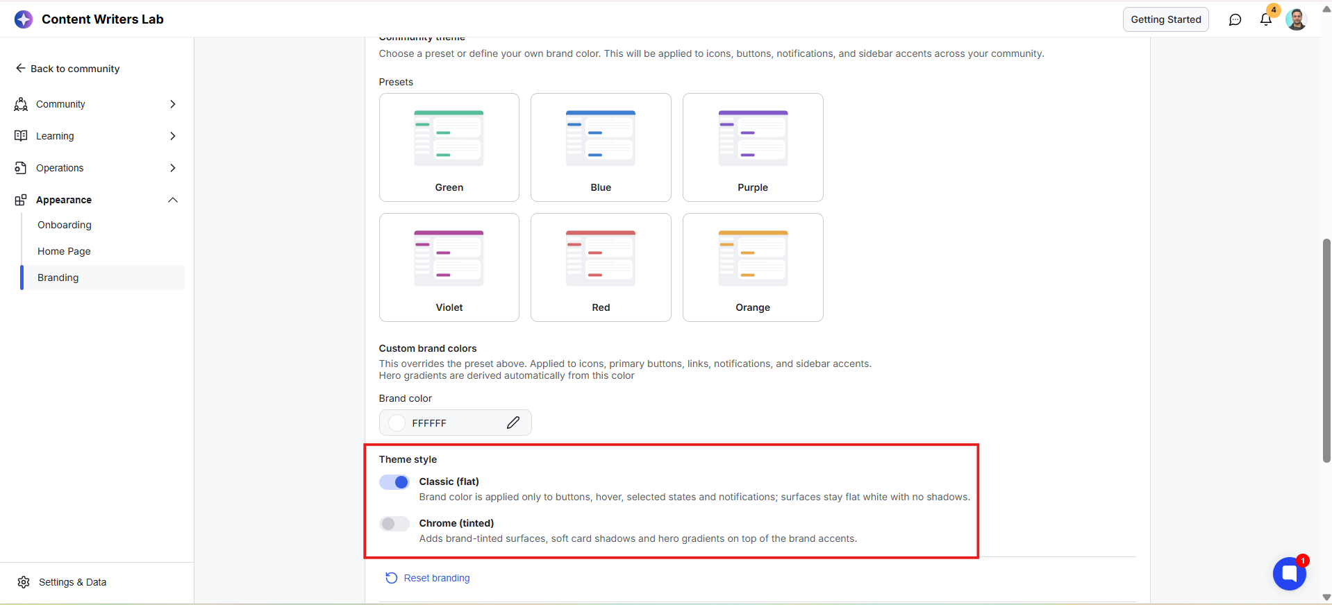
Classic (Flat): Applies your brand color to buttons, hover states, selected items, and notifications while keeping the rest of the interface clean with flat white surfaces.
Chrome (Tinted): Adds soft brand-colored backgrounds, subtle card shadows, and automatically generated hero gradients to create a richer, more branded look while keeping the interface clean and easy to navigate.
Note: Only one theme style can be enabled at a time. Selecting one automatically disables the other.